
Lore Olympus Article Layout
Team Work | Illustration | Editing
This project was developed in response to a university brief to collaboratively design and produce a magazine, with full creative control over topic and target audience. Each team member was required to contribute two written articles with all photography and illustrations created in-house.
The Challenge
Alongside the creative brief, a key challenge was establishing a cohesive visual identity within a newly formed team.
Aligning schedules, maintaining engagement and navigating differing creative perspectives required clear communication and organisation. The magazine needed a defined concept that would resonate with design students while remaining visually consistent across contributors.

Design Approach
The objective of my animation spread was to generate curiosity around the adaptation while capturing the distinctive visual language of Lore Olympus.
To reflect the tone of the story I thought of ways to represent the intimacy, curiosity and subtle romantic tension between the main characters. I designed layouts featuring large scale illustrations and flexible grid systems that adapted throughout the project in response to tutor feedback.


I created hand-rendered illustrations using coloured pencils and fineliner on textured paper to echo the painterly quality of the original graphic novel.
After scanning the artwork, I refined the colours digitally and incorporated textured and splatter brushes in Photoshop to maintain authenticity.


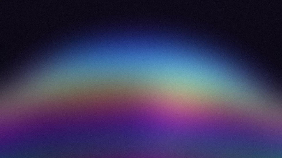
For the background, I introduced space inspired ink washes to evoke mystery and depth, symbolically reflecting the story's atmosphere.
These were adjusted digitally to ensure visual harmony and prevent them from overpowering the characters.

The final design
Combining elements from my initial thumbnails led to the final spread designs. The first spread functions as an introduction, presenting the title while drawing the viewer into the narrative.
The two colour palettes associated with the protagonists are subtly merged, symbolising the union at the heart of the story and reinforcing the concept of two distinct worlds coming together.


The second spread reveals the full article alongside both characters. I arranged them diagonally to emphasise their roles as counterparts from opposing realms, visually suggesting movement toward one another. Their eye contact creates a sense of intimacy and suspense.
The dynamic background cut directs attention toward their interaction while framing the article content. The column structure was formatted to align with my colleagues’ layouts, ensuring visual consistency across the magazine.
My Role & Contribution
I took an active role in coordinating meetings, tracking progress, and helping guide discussions to maintain focus. Through group brainstorming and collaborative decision-making, we established our concept: a design-focused magazine aimed at design students, covering topics such as film and media, pop culture, animation, architecture, web design, innovation and sustainability.
I was responsible for two feature articles: one exploring the announcement of Lore Olympus being adapted into an animated series, and another focused on sustainable innovation in packaging design.


